Practice: Task 1 - Graphs (2026)
Updated: Tháng 4, 2026

GRAPH WITH TIME
Đề 1: The graph below shows the average monthly change in the prices of three metals during 2014.

Đề 2: The charts give information about employment in the UK in 1998 and 2012.

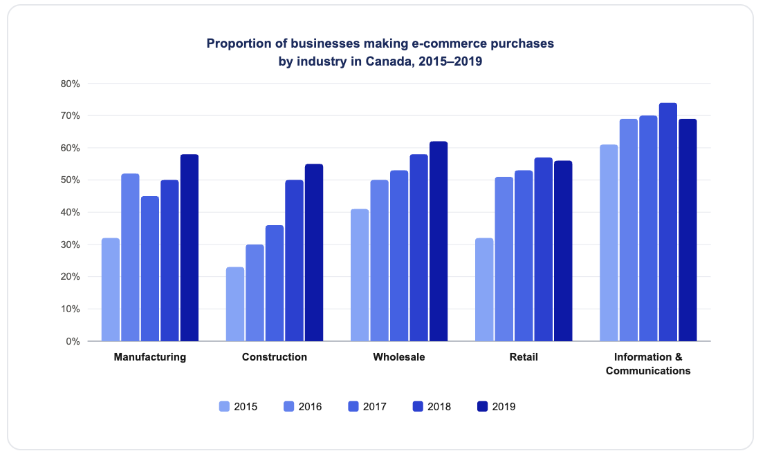
Đề 3: The chart below shows the proportion of businesses making e-commerce purchases by industry in Canada between 2015 and 2019.

Đề 4: The bar chart shows the percentages of the Canadian workforce in five major industries in 1850 and 2020.

Đề 5: The graph shows data about the annual earnings of three bakeries in Calgary, 2000-2010.

Đề 6: The line chart below shows the results of a survey giving the reasons why people moved to the capital city of a particular country.

Đề 7: The graph gives information about the age of the population of Iceland between 1990 and 2020.

Đề 8: The table below shows the changes in some household types in Canada from 1984 to 2020.

Đề 9: The chart gives information on the percentage of women going into higher education in five countries for the years 1980 and 2015.

Đề 10: The graph gives information about male and female gym membership between 1980 and 2010.

Đề 11: The graph below shows the percentage of part-time workers in each country of the United Kingdom in 1980 and 2010.

Đề 12: The graph shows the number of visitors to four international museums between 1980 and 2015.

Đề 13: The pie charts below show the devices people in the 18 to 25 age group use to watch television in Canada in two different years.

Đề 14: The table below shows the percentage participation of women in senior management in three companies between 1975 and 2015.

Đề 15:
The chart shows the proportion of businesses making e-commerce purchases by industry in Canada between 2015 and 2019.
Đề 16.
The charts give information about employment in the UK in 1988 and 2012.
Đề 17:
The table shows the changes in some household types in Canada from 1984 to 2020.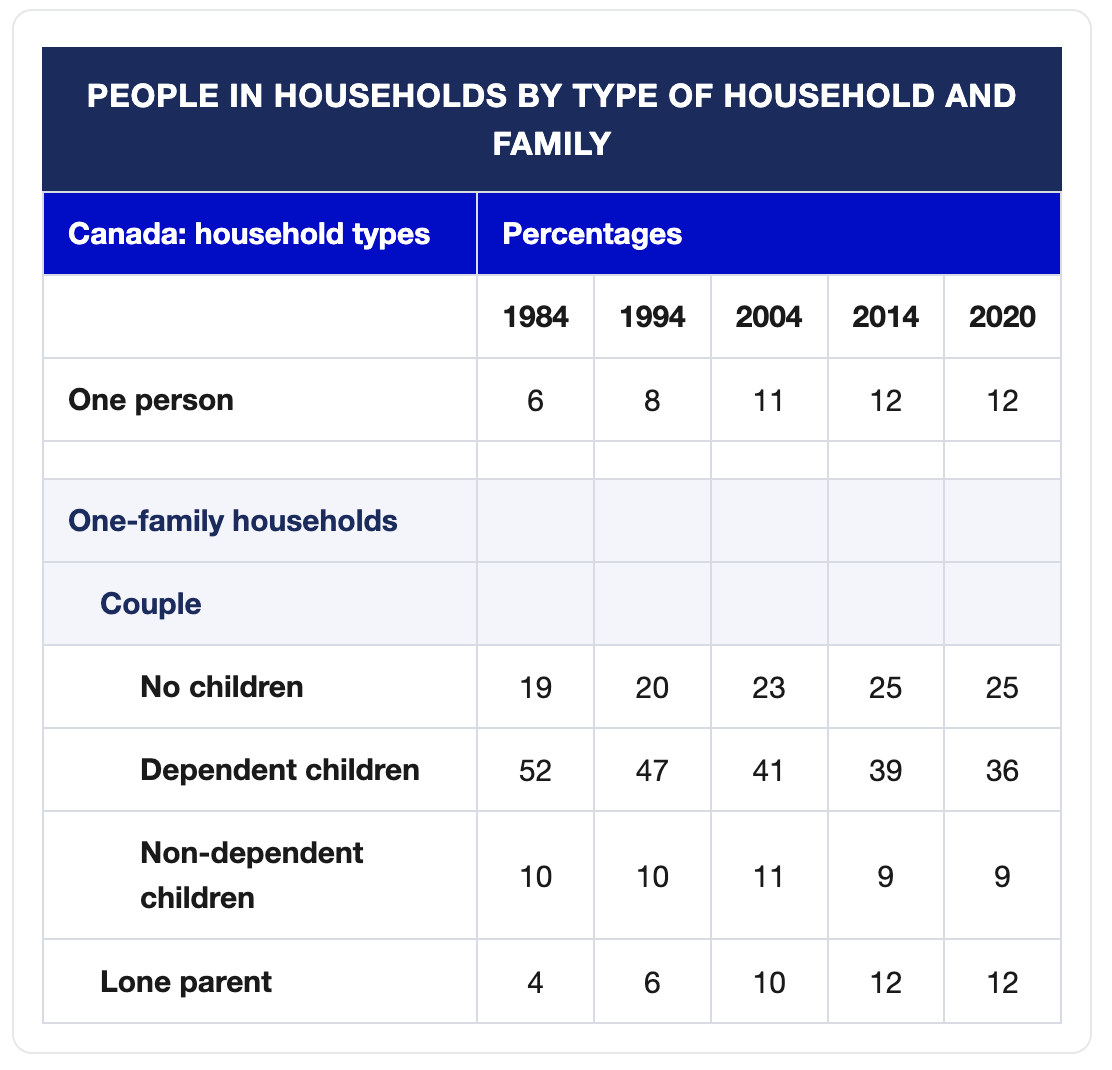
Đề 18:
The chart shows the proportion of businesses making e-commerce purchases by industry in Canada between 2015 and 2019.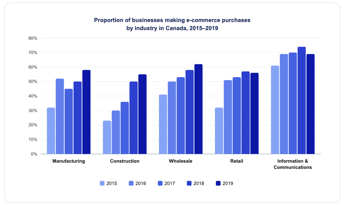
Đề 19:
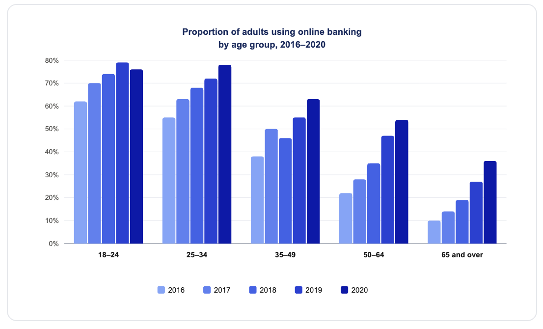
The chart shows the proportion of adults in five age groups who used online banking in a particular country between 2016 and 2020.
GRAPH WITHOUT TIME
Đề 1: The table below shows how patients evaluated different services at three health centres.

Đề 2: The chart shows the average number of hours each day that Chinese, American, Turkish and Brazilian tourists spent doing leisure activities while on holiday in Greece in August 2019.

Đề 3: The graph below shows the average daily sales of selected food items at the Brisk Café, by season.

Đề 4: The tables below show people's reasons for giving up smoking, and when they intend to give up.


Đề 5: The table below shows the estimated literacy rates by region and gender for 2000-2004.

Đề 6: The bar charts below give information on road transport in a number of European countries.


Đề 7: The chart below gives information about global population percentages and distribution of wealth by region.

Đề 8: The graph shows data on the manufacture of passenger cars in 2015.

Đề 9: The graphs below show the post-school qualifications held by Canadians in the age groups 25 to 35 and 45 to 55.


FUTURE GRAPH
Đề 1: The pie charts below compare the proportion of energy capacity in gigawatts (GW) in 2015 with the predictions for 2040.

Đề 2: The charts show projections for global production by sector in 2040 and 2060.

Đề 3: The bar chart below illustrates five different industries’ percentage share of Brazil’s economy in 2009 and 2019 with a forecast for 2029.

Đề 4: The table below shows top ten countries with largest population in 2019, and how it is projected to change by 2100.

Đề 5:
The graph shows the CO2 emissions of five regions from 2000 to 2020, and predictions up to the year 2040.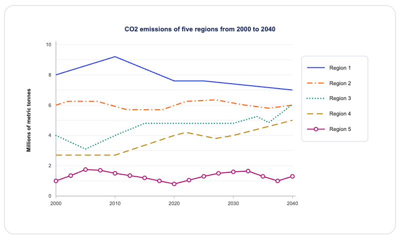
MIXED GRAPH
Đề 1: The bar chart and table show information about students from abroad studying in four English-speaking countries in 2004 and 2012.

Đề 2: The charts below show the favourite takeaways of people in Canada and the number of Indian restaurants in Canada between 1960 and 2015.

